Applying Color Psychology To Direct Mail
Color is a key influencer in one’s decision to make a purchase. Although your messaging needs to be strong, color can prevent your message from resonating with your target audience. This is why it is important to know the audience you are targeting and what specific colors for this audience would be best to use. This is important because according to Satyendra Singh, it takes only 90 seconds for a customer to form an opinion about a product. Moreover, 62-90% of that interaction is determined by the color of the product alone.We are going to give you a basic understanding of color psychology so you can optimize your direct mail campaign with greater intent.
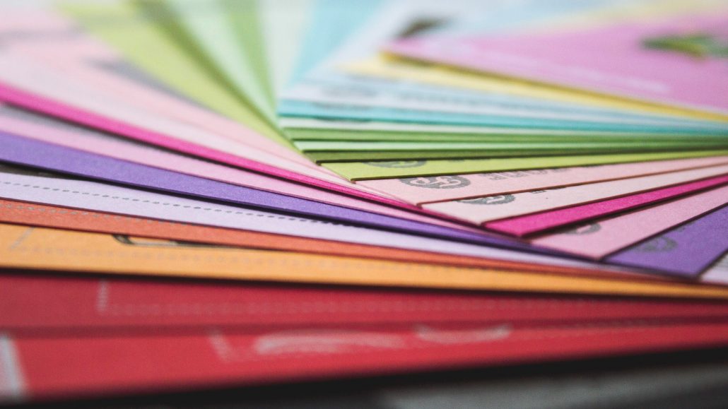
Basic Color Generalizations
When you are approaching your color selections, you should be aware of on a basic level what color categories evoke in the the viewer. According to an article by the Entrepreneur called “10 Direct Mail Secrets,” typically “warm colors are exciting and energizing; cool colors are relaxing and refreshing. Bright colors speak loudly; dull colors suggest quietly.” With these in mind, you can start to narrow down what color scheme would be best suited for your direct mail materials. Of course, when color is involved you have to consider price, that is why you should limit your direct mail piece to one to two colors. Not only will it save you money, it will also make sure you don’t overwhelm your prospect—in this case, more is not better.
Narrowing Down Your Colors
So the main concern of any color selection is determining which ones will help produce conversions. Here is a basic rundown of what color each means from Color Psychology In Marketing: The Complete Guide:
- Red-emotion, love, fear, and survival. Due to the latter, it is important to use it sparingly. It is a great color to get someone’s attention.
- Orange-physical comfort, warmth, food, and shelter. Excites appetite.
- Yellow-happiness, uplifting, radiant. Excellent option if your message is positive, but this color also should be used sparingly for it is known to cause anxiety if used too much.
- Green-nature, peace, harmony, balance. Great for reducing stress and promoting overall well-being.
- Blue-cerebral, mentally relaxing, non-physical response. Useful for producing a sense of calm and trust. Used too much though can make one feel cold and disconnected.
- Purple-spiritually uplifting, physically soothing, energetic, imaginative. Can evoke opulence, magic qualities, and mystery. Too much purple can be distracting.
- Pink-sensitive, nurturing, romance. Evokes a sense of understanding, but too much can make your message come off as immature.
- Brown-stalwart, symbol of protection, stable. Brown can come off a bit boring, but as with all colors, it’s all about context.
- Black-serious, independent, evil, death. This is a double edge sword for too much can produce the last two unwanted reactions, but used sparingly can be used with great effect.
- White-purity, clean, peace. Can trigger a sense of new beginnings, but can also cause someone to feel isolated or lonely if used too much.
Picking The Right Colors
As you can see, color can make or break the message you are trying to convey. Carefully consider how you want your target audience to react to your message, and use that to focus in on what colors would be best. With each color, there is a threshold that you will determine if it is just the right amount, or too much, which can change the meaning of your message. As with all marketing strategies, the best place to start is gathering as much information as you can about your audience. Doing so will make sure you do not select an ineffective or misleading color.


Leave a Reply
Want to join the discussion?Feel free to contribute!